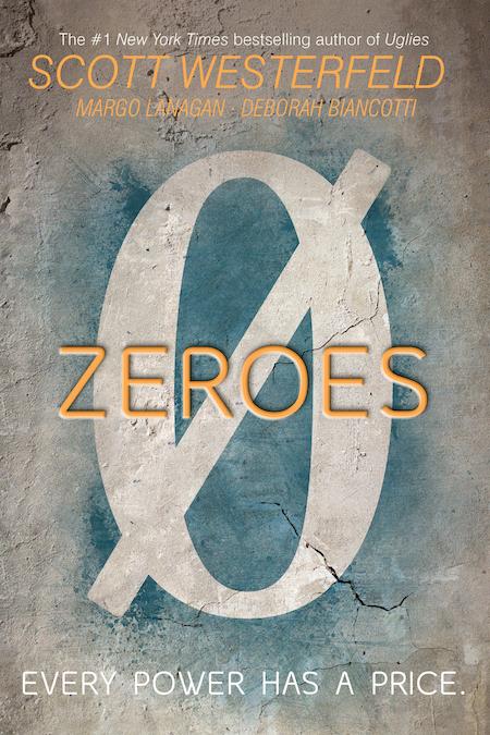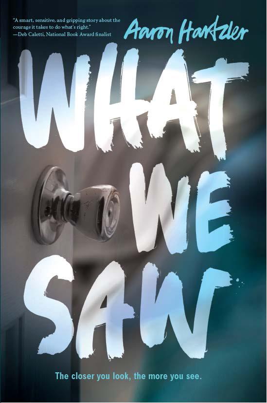
This cover was done by Regina Flath who has designed some of my favorite covers. This one feels like the usual gender neutral dystopian ala Endgame…but I am kind of side-eyeing how big Scott Westefeld’s name is here. Apparently this is a collaborative project between the three authors, but his name is SO much bigger than the other authors. – Kat
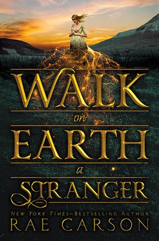
This cover is super on the nose…this book is about a girl who senses gold in the ground during the Gold Rush and this cover has so much gold in it. I’m sure it will be super shiny in person. -Kat
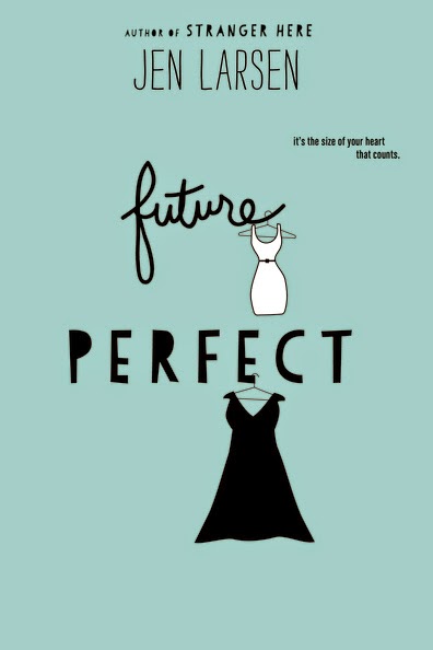
This is another body positive book from Harper Teen. Like Dumplin is clearly states this is about a girl who is plus sized. I like the colors and I am really likeing these illustrated covers because it’s clear each artist has their own style. I wonder if Eleanor & Partk inspired this trend ? Will we see those 90’s illustrated YA romances make a comeback ?
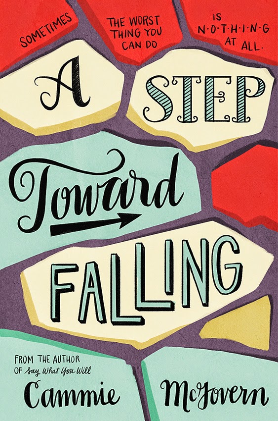
There is way to much text-pyrotechnics going on here with the different fonts. It doesn’t have the flow her last book cover Say What You Will does.
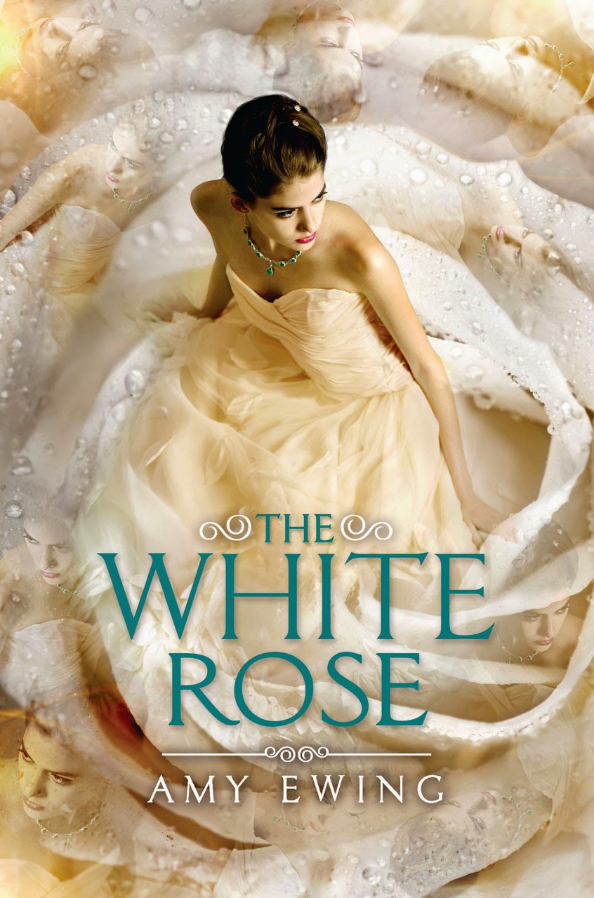
At first glance this is a pretty decent girl in a pretty dress, but looking closer the faded images of her face in the corner look like something from awkward family photos.

I think this is the UK cover and I really hope they keep it for the U.S. because it’s so clean, the fonts mix nicely and I like how it looks like a graphic-T design. Also, this books sounds amazing, it’s like shifted perspective of the person who is just a background friend to the “chosen one” protagonist of a YA novel.
I don’t know anything about this book and this cover and title doesn’t tell me anything. It’s kind of spooky and I wonder if it will be shiny in person ?
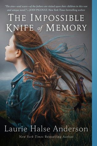
I feel like Laurie Halse Anderson always gets the strangest covers. The cover looks very 90’s to me…maybe it’s the jean jacket ? It’s also worlds away from the original cover which is mostly text.
 |
This is Smith’s first book and this design makes this te third cover re-design for this book. They’ve changed it fit more with her other books, but the handwritten comic-y text just doesn’t work with such a short title. I have to admit I’m partial to the original paperback design (that yes, I own)

This is a companion to Duncan’s previous novel Salvage, I want to say yay person of color on the cover, but this image looks so processed. I wish they’d just stuck with no model. But still…yay POC on a book!
