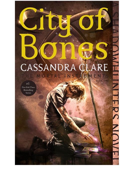
City of Bones has a hardcover, movie tie-in paperback and now this new paperback cover. I like the powerful posing in this, but I’m not feeling that mustard yellow coloring on the font. I can see a lot more people carrying this around since there is no bare chest on it. – Jess
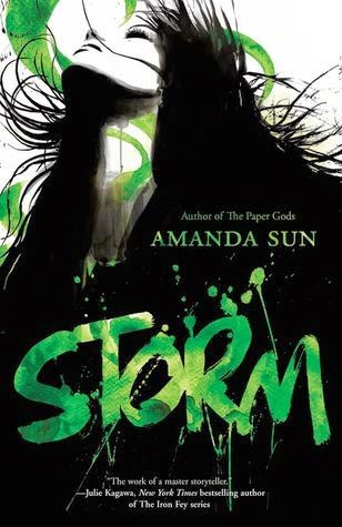
I like how this image looks like it is moving and keeps in line with the other books in the series. I also like the green–we don’t see a lot of green in YA covers. – Kat

This cover is very striking and I think it will have great crossover appeal it looks like a YA, but also a dark literary fiction or even a steampunk. I like the metallic feel and coloring in the background. That said, it looks a lot like her Grisha Trilogy, but maybe that is intentional – Kat
The graphical elements on this cover makes it look like a graphic novel cover to me. I’m not a fan of the muted colors on this cover and the font that the author’s name doesn’t really mesh with the cover. – Kat

This kind of reminds me of the I Was Here cover by Gayle Foreman, but something about the font and books make it look cheesy. I also had a hard time reading the title font. – Kat
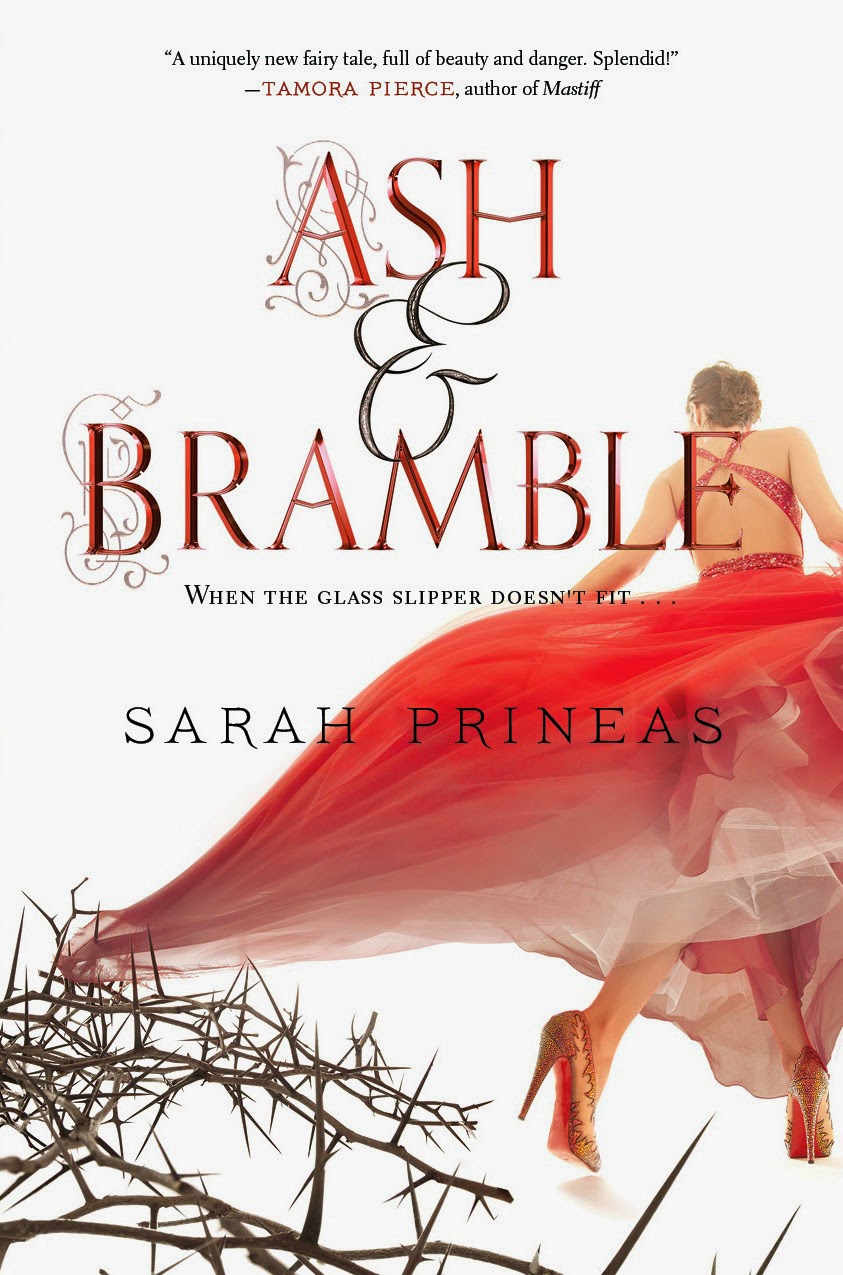
This cover looks a little too photoshop-y to me and also unfinished. Maybe it’s all the white space ? – Kat

Based on this cover I would have never thought this was YA. This book is about a plus sized girl who enters a beauty pageant and I like how that is all right there on the cover. The fonts are clean, the colors are complementary and I can’t wait to see what this looks like in person. – Kat

This is another graphical, cartoon-y cover that if I didn’t know any better I’d think was for a graphic novel. I think this cover is fun and fits the book theme of complicated friendship. Also, I think that’s a person of color I see in there… – Kat
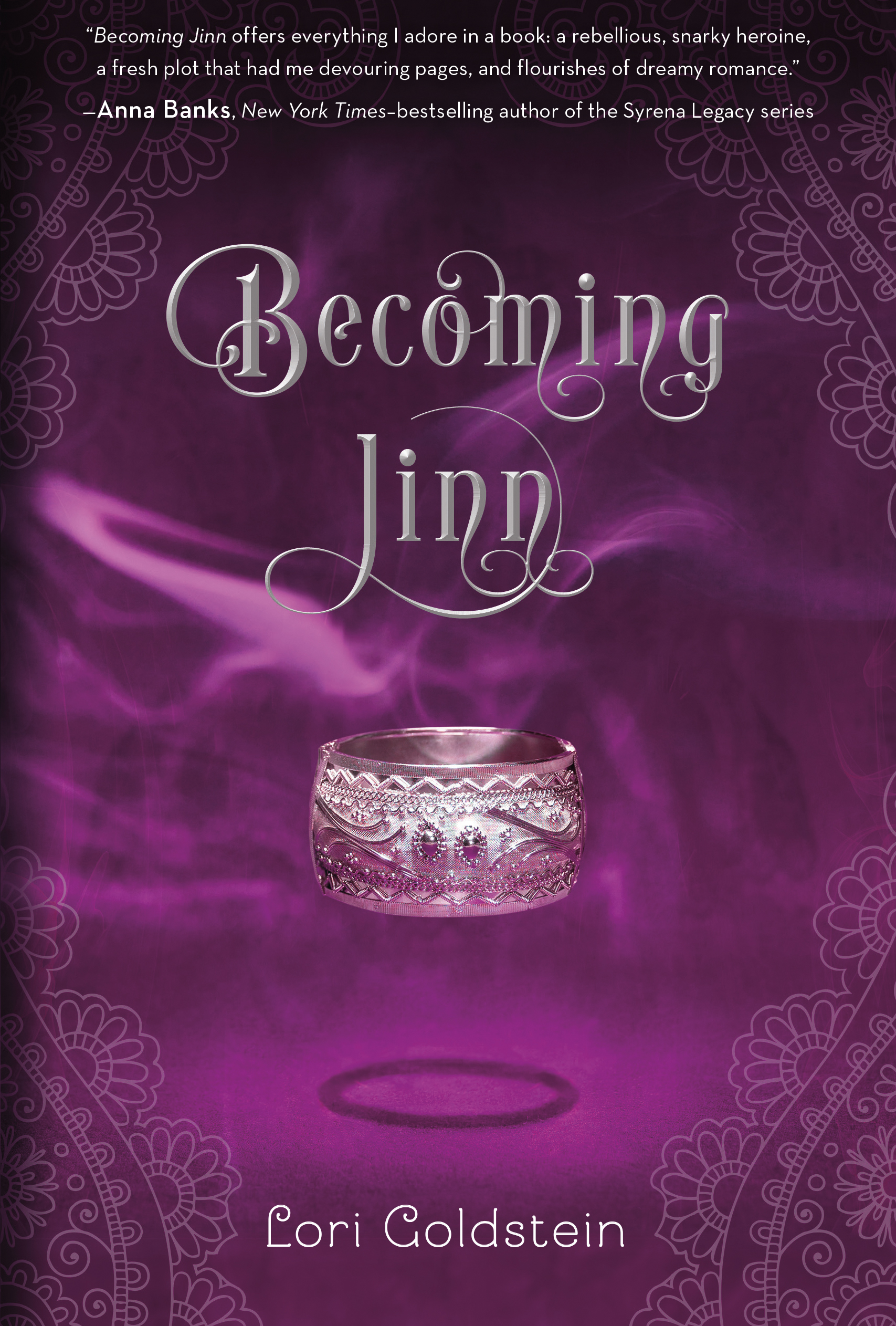
This is a cover re-reveal. The originally released cover was red and I have to admit I like the purple better. – Jess

For some reason I saw this and went “meh”. I see what it is trying to do with the creepy black and white image with striking red font, but it doesn’t jump out to me. – Jess
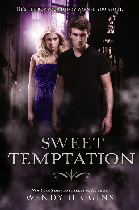
I like the covers in Higgins’ Sweet Evil series, even though they are the cliched YA paranormal covers . Kai is in the front because this is told from his POV. I have to be honest that tagline just creeps me out . . . – Jess