One of the best parts of books are the covers ! Each week we’ll look at the recent cover reveals and give some judgement. . . even though we have no qualifications whatsoever.
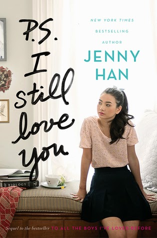
The lighting and coloring are so pretty on this sequel to Jenny Han’s To All The Boys I’ve loved Before. I even adore the script . . . but it is just looks way to similar to the first book.
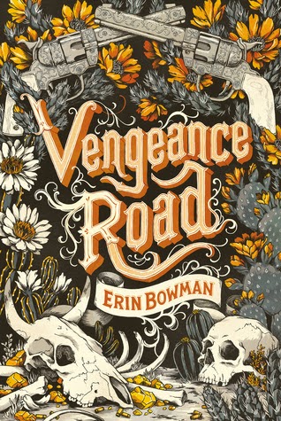
I liked the gritty tattooed look this cover has. This is a historical about a girl disguising herself as a boy in the Wild West and I’m not sure the cover quite captures that.
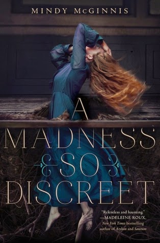
A nice twist on the “girl in a pretty dress” the more you look at this cover the creepier it gets. I mean what’a happening here ? Is she being pulled down to hell ? Into a graveyard ? Also how creepy is that hand ?
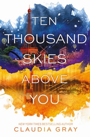
The colors in this cover just doesn’t strike me the way the first book in this series, A Thousand Pieces of You did. It gets the point across that the books are in a series but this one just isn’t as dynamic.
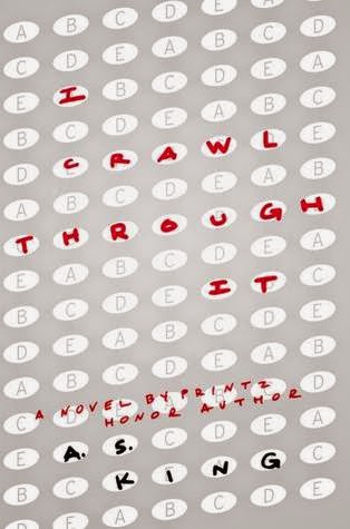
A.S King never gets the same type of cover twice. Digitally, this image falls kind of flat, but I think it will pop in hardcover if it has a matte finish. I feel like they are trying to give it a more “grown-up” feel.
I think this is her weakest cover. A.S King’s books are all about character and I think that’s why most of her recent covers have faces looking right at the reader. This cover really doesn’t grab me…if you didn’t know any better you’d think it was an SAT prep book. – Kat
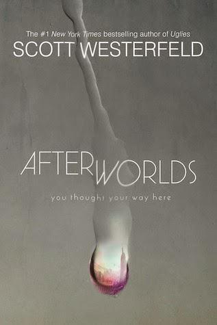
This paperback of Afterworlds is kind of like an inversion of the hardcover. I like the simplicity of the typeface ( I love me some San Serif font) and honestly the waterdrop motif just looks cooler here. This cover does give an oddly Dystopian feel. This so should have been the cover for The Uglies.
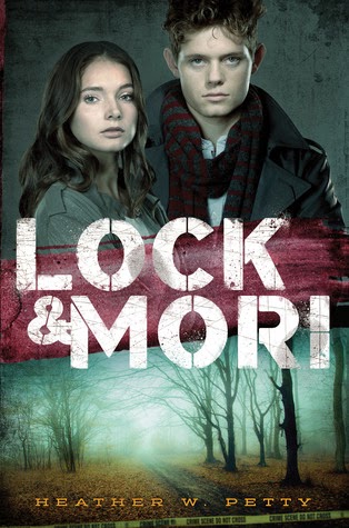
It’s not often we see front facing models on YA covers anymore, I suspect they did this to let people know that the book is about a boy and a girl. This looks a lot like a glossy photoshopped ad for a CW TV show.
What do you think of the covers this week ? Did we miss any ?
1/2 of the blogging duo at Books and Sensibility, I have been blogging about and reviewing books since 2011. I read any and every genre, here on the blog I mostly review Fantasy, Adult Fiction, and Young Adult with a focus on audiobooks.