One of the best parts of books are the covers ! Each week we’ll look at the recent cover reveals and give some judgement. . . even though we have no qualifications whatsoever.
…
We're an Open Book

One of the best parts of books are the covers ! Each week we’ll look at the recent cover reveals and give some judgement. . . even though we have no qualifications whatsoever.
…
Cover art gives our favorite books a unique identity, but when different publishers find the same image–readers get a little deja vu. So, who do you think wore it best? The paranormal or the contemporary?
Paranormal
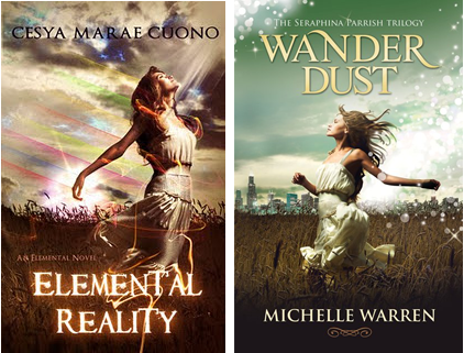
Contemporary
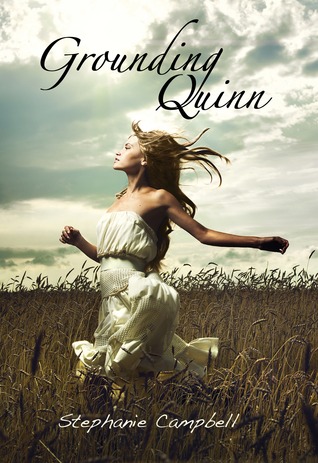
It’s interesting how the paranormal covers add light effects to give the model a more ethereal and powerful feel, while the contemporary keeps it simple and clean.
I like them all, but I like Wander Dust the best. I think the text and the lighting effects fit together nicely. Who do you think wore it best?

The most anticpated cover reveal of the year has come. City of Lost Souls, the fifth book in Cassandra’s Clares Mortal Instruments series. I still haven’t read City of Fallen Angels so no spoilers !
The cover is designed by Cliff Nielsen who we featured forShelf Candy Saturday. . . We couldn’t help but notice that this covers borrows from some of his previous work.
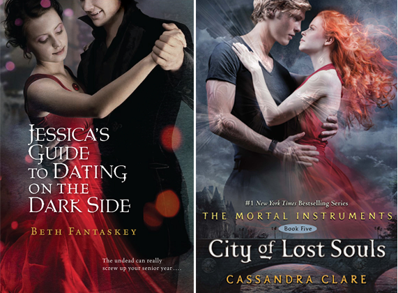
Gentlemen in black. . . check
Ladies in red. . . check
Orange font with authors name. . . check
White font with title. . . check
Extra serifs in font . . . check
Hazy dark blue background . . . check
This is the first cover in the Mortal Instrument series to feature two complete faces. Is it just me or does the male illustration (yes, those are illustrations) look like Jamie Campbell Bower who is set to play Jace Wayland in the film and Alex Pettyfer who was rumored to be playing him
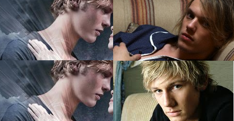
look at the nose and eyes.
I’m also a little shocked that after five books Isabelle has not been featured on a cover. What are your reactions to the cover ?
Confession. Ever since I discovered dafont.com and blogs I have become a font enthusiast. Seriously, I can be in a store sometimes and point out a font I recognize by name, so I couldn’t help but notice that a certain font has been popping up on a few book covers.
See it !? That looping “marker” type font

…
They say don’t judge a book by its cover, but ever so often Books and Sensibility contributors take a stroll around the local bookstore (okay, the internet) to see what we can find in the world of book covers
Clearly Wal-Mart is Team Edward

Seriously, all of the trade paperback Breaking Dawn movie tie-ins in my Wal-Mart were like this. I think someone at Wally world has a sense of humor.

Books and Sensibility is participating in NaBloPoMo. What’s NaBloPoMo ? Find out here !
They say don’t judge a book by its cover, but every week Books and Sensibility contributors take a stroll around the local bookstore (okay, the internet) to see what we can find in the world of book covers
Is the book you are reading a historical romance ? Does it have a prominent female character ? Is it Steampunk ? If you answer yes to two or more of these than your cover may have a corset on it.
I’m not surprised corset covers have become so popular. Corsets are a classic (although harsh) symbol of femininity and are popular among Victorian authors, cosplayers and readers.

Do you have any favorite corset covers ?

Books and Sensibility is participating in NaBloPoMo. What’s NaBloPoMo ? Find out here !